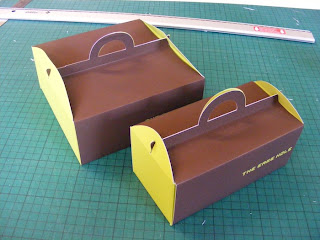
It was the black/green colour scheme that wasn't working for me, mostly, since I changed the logo and typeface. It looked far too matrixy, so I changced the black to a nice chocolate brown and it made everything worlds better, particularly when the packaging changed to the new set here. Instead of using ribbons as handles, which was ridiculous, why did no one tell me that was stupid? I made boxes with handles built in for cupcakes so that they could easily be carried. I designed bags for the traditional flat cake boxes.
Subscribe to:
Post Comments (Atom)


No comments:
Post a Comment