OUGD303 Module Evaluation
The last module has definitely been the most challenging one that I have faced so far though I feel that I have risen to the challenge and produced a substantial amount of work of a high and professional quality. I feel that I have gotten some great portfolio pieces out of the projects that I have been working on and am really pleased with the outcome of them.
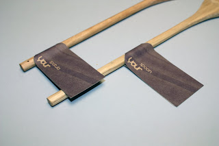
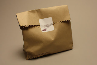
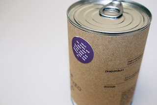
I feel that I managed my time well over the course of the module, though the only issues that really arose from time management was working on collaborative briefs, of which there are several. The main issue that arose was finding time to work on the briefs when neither of the collaborators had something else more pressing that they were working. While the collaborative briefs took a little time to get off the ground, I feel that in particular, First Tuesday and The Sustainable Supermarket were execute very well. I have made the same mistake as I did in the previous module of not setting myself deadlines on my substantial briefs and so a fair amount of dithering was going on, at least at the beginning of the module.
I had intended on completing another brief, The Body Shop, for which I had begun to put research on my blog, though my other briefs seemed to take up more of my time and it kept getting pushed aside until I had to make the decision to not go forward with it. I made this decision in the middle of May when I realised that I would not have the time to take it further.
The only brief that I seemed to have any issues with was the International Rescue Committee brief which was collaboration with Craig Laing. The problem was that we had printing issues and so were not able to produce as many products as we had made icons for, so the product shots for the boards seemed a little sparse. Even so, I feel that the brief was successful and in hindsight, maybe adding more products would have made the boards cluttered. I also let myself down with this brief through a lack of documentation and blogging, which I should have been keeping on top of.
During the course of this module my rationale and position statement have not had to change at all because I feel that I hit the nail on the head with what I was about as a designer on the head pretty early on. Though in comparison to the previous module, I feel like my Final Major Project briefs were written around my rational and I was able to do more sustainably driven work. In the previous module, I went against my position statement a little and was not as sustainably driven, and so was not as focused. My rationale has not changed at all because I know exactly where I want to be in industry.
One of my downfalls in this module is that I began working on my Context book quite late in the game, even though I was determined not to let it slide. I put most of my focus on the briefs I was working on and barely touched upon my Context book until roughly a month before the deadline. I already knew what I wanted to do, and had a lot of research already in place, though I was very late in starting to design and craft the actual product. Even though I was quite late in starting it, I am pleased with the outcome and I feel that it effectively goes hand in hand with my design practice. I feel that my blog may let me down when it comes to my context book because the majority of the research that I used for it, I already had in place from my dissertation, and so created an indepth bibliography within the book rather than try and record it all on my blog.
After these three years I feel that I have managed to produce a great body of work and a great portfolio. I feel confident in my ability to approach and talk to professionals in the industry and feel that I am not a student, but that I am a professional already, and that I am ready to dive straight into the deep end. I am very happy with the work that I have produced and have used these three years as ‘play time’ to do the work that I want to do before I head out into industry and must work under the constrains of a client at all times. I loved it. Thank you.


