
Showing posts with label End of Year Show. Show all posts
Showing posts with label End of Year Show. Show all posts
Friday, 3 June 2011

Monday, 30 May 2011
End of Year Show: Web Presence
I took screen shots of the college website in order to put my End of Year Show branding onto it to represent the webpresence of the design. The site is a bit of an odd layout so I did two options, one with the header of the webite and another scrolled down a bit more.


And I mocked them up on macbooks to show how they would appear.


And I mocked them up on macbooks to show how they would appear.


End of Year Show: Expanded Range
Going back to another brief I did what feels like forever ago (on my birthday I remember), I decided to expand the brief a little more for submission. Through expanding I wanted to add things to the range such as cotton bags, t-shirts to be worn by members of staff and students involved in the show as well as adverts to appear in magazines such as Grafik and Creative Review.


I much prefer the images that I made using the photograph below to the ones above this text because the below ones feel much more personal and it looks more like a context shot than just a bag sitting on a white background and looking really boring.


I really like the below layout because it sits nicely in the corner of the bag and it's more aesthetically pleasing than the rest I have produced so far.


Some layout options for adverts to appear in magazines such as Grafik and Creative review. I did both landscape and portrait options depending on the space in the magazine. Layout is not my strong point so they aren't the best things in the world but they are only mock ups and I believe that they represent what I wanted them to. I couldn't find a stock image of a magazine ad page to mock them up onto and I have mor eimportant things to be getting on with so they are simply going to have to stay not in context.
This top image is my favourite of the landscape images. I really like the staggered paragraphs of the type as they go across the page.


This is the best of the portrait options in my opinion, out of the few options that I made. The layout sits the best with me out of all of them.

T-shirt mock ups testing out layout sizes and placement.

I think that this one works the best out of all three options that I've shown here. I like the one with the smaller type but it's not consistent with the posters and the sizing of the logo on there so I have gone with the larger type that tretches all the way across the t-shirt.


I much prefer the images that I made using the photograph below to the ones above this text because the below ones feel much more personal and it looks more like a context shot than just a bag sitting on a white background and looking really boring.


I really like the below layout because it sits nicely in the corner of the bag and it's more aesthetically pleasing than the rest I have produced so far.


Some layout options for adverts to appear in magazines such as Grafik and Creative review. I did both landscape and portrait options depending on the space in the magazine. Layout is not my strong point so they aren't the best things in the world but they are only mock ups and I believe that they represent what I wanted them to. I couldn't find a stock image of a magazine ad page to mock them up onto and I have mor eimportant things to be getting on with so they are simply going to have to stay not in context.
This top image is my favourite of the landscape images. I really like the staggered paragraphs of the type as they go across the page.



This is the best of the portrait options in my opinion, out of the few options that I made. The layout sits the best with me out of all of them.

T-shirt mock ups testing out layout sizes and placement.

I think that this one works the best out of all three options that I've shown here. I like the one with the smaller type but it's not consistent with the posters and the sizing of the logo on there so I have gone with the larger type that tretches all the way across the t-shirt.


Friday, 18 March 2011


Thursday, 17 March 2011
Inside of the poster
I have used this net before, the staggered concertina that I designed for the Leeds College of Art Newsletter last module. I brought it back because I still really like it and think it to be a far more interesting fold than a basic concertina, and figured it would make something interesting with this.
Layout is not my strong point at all, not for publications so this really isn't that good. But this is such a fast turn around brief, pretty much a matter of hours, that I don't have time to really play and make it amazing. I have a last minute print slot to make or I won't get this submitted tomorrow. I used the yellow that I used on the posters for the smaller type because it's so eyecatching and such a lovely colour. I took the images and created a duotone with them using the yellow and it makes it much more interesting.


Layout is not my strong point at all, not for publications so this really isn't that good. But this is such a fast turn around brief, pretty much a matter of hours, that I don't have time to really play and make it amazing. I have a last minute print slot to make or I won't get this submitted tomorrow. I used the yellow that I used on the posters for the smaller type because it's so eyecatching and such a lovely colour. I took the images and created a duotone with them using the yellow and it makes it much more interesting.

No time for design sheets, I am completing this brief in 6 hours. I had an idea in my head of what I wanted to do and obviously this idea didn't coem to me until very late in the game. 2 in the afternoon the day before the submission date, to be exact, so I had until 8.30 to get it printed.
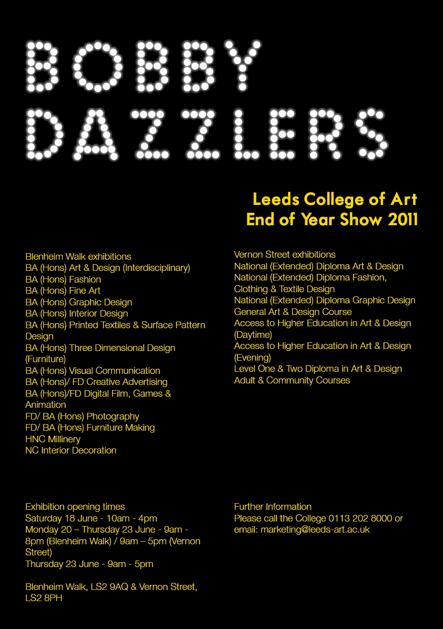
I jumped straight onto illustrator and tried to create a name in lights kind of vibe. I played with both yellow and white on black and found that I much preferred the white. It looked a lot more like spot lights than the yellow did.
 Layout tests.

I got the yellow in there somewhere in the end using the smaller type. I find that yellow on black is a very striking combination. It's not the best thing I've ever done, but this is of course only a pitch, and I find that it gets the idea across that I want to convey.

I jumped straight onto illustrator and tried to create a name in lights kind of vibe. I played with both yellow and white on black and found that I much preferred the white. It looked a lot more like spot lights than the yellow did.


I got the yellow in there somewhere in the end using the smaller type. I find that yellow on black is a very striking combination. It's not the best thing I've ever done, but this is of course only a pitch, and I find that it gets the idea across that I want to convey.

Wednesday, 16 March 2011


Subscribe to:
Posts (Atom)