We're all used to seeing headphone packaging that looks like this, right?
Molded plastic, hard to get into without cutting it open and then the plastic edges are sharp and you cut yourself on them. It's a ridiculous amount of unnecessary plastic. Plastic isn't even needed for this.
Which is why I was actually excited when I received my new Urban Ears headphones through the post. No plastic, no plastic at all, just all cardboard, very easy to get into and 100% recyclable.
This was the packaging that my housemate got his new headphones again, again no plastic at all, just layers of corrugated cardboard with the shapes of the headphones cut out. No actual binding in this one either, whereas the Urban Ears box was secured with adhesive, this one is secured with tabs.
Monday, 31 January 2011
Book of swing tags
Fred was turfing out the office and this book that one of the students who've left put together in their second year, it was pretty interesting to rummage through. It's jam-packed with swing tags from all kinds of brands of clothing. I have a pretty mass collection of these myself, I'm such a hoarder.
Final statement of intent
Saturday, 29 January 2011
First Tuesday product shots
We booked some lights out from photography and set up in studio 3. I've never actually used studio lights when photographing work before and I don't particularly know how to set everything up, but luckily for us, Becca did! Hurrah.
These are the old tickets,
And then these are the new tickets with the amended information on them next to the amended bingo tickets, all spelling errors fixed.
Showing how the business card booklet works and how the cards tear out. The slots in which to store loose business cards can be seen on the opposite side of the book.
First Tuesday pen
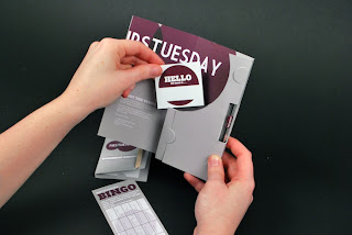
Name sticker in usage.
How the pen slots into the welcome pack and can be seen while the pack is closed.
The inside of the pack with everything in it.
Oops, the elastic band is supposed to be purple here.
Information on the inside of the pack.
The poster! This is actually the old poster and we didn't realise until after we'd taken all the lights back to photography so we need to get them back and photograph the new poster.
Trying to capture our spot varnish in a photograph is quite difficult but I think we managed it just fine here.
Friday, 28 January 2011
First Tuesday website.
From the design sheets that we both did, Becca was the one to create the proposals for the website and here are three examples of pages from the website that she created. I really like the layout and think that it works really nicely. Everything else has been in the ticket, tall and thin format which we obviously couldn't use for a website but this works really nicely.
Thursday, 27 January 2011
Subscribe to:
Comments (Atom)


