Okay so we had a live brief come through over email from Fred. It was supposed to happen last year and one of my course mates did the previous design for it, but it didn't happen and so they're trying again and want a new design for it. There were only a few of us wanting to pitch for it so I thought I'd give it a go. Worth a shot.
Here's the brief.
I seem to have accidentally misplaced my design sheets for this for now, so until I find them I'll just post my progress in Illustrator.
I came up with a couple of different design directions to run with and see what I can do. I picked them out from my design sheets, of course.
This direction has a kind of vintage feel to it, sort of like design from the 50s with the colours as well as the typeface. The typeface is called Motor Oil and I found it on dafont, it has a really nice 1950s feel to it. I'm not sure why a lot of my design has a vintage feel to it lately. I like the colour, more of an orange than red, and I tried to make a gradient but it didn't sit too well with me so I went back to the solid colour. I preferred the orange to the red as I felt that it made the 'cow print' logo stand out a little better.
I took it into InDesign to use grids properly to try and lay out the text. I didn't know the actual text for what was going onto this so I used the information that was supplied on the brief purely for layout purposes.
I like the below one but I'm not sure that people would be compelled enough to step in to read the print at the bottom. Posters only grab our attention for a matter of seconds so I have to convey the necessary information as quickly and simply as possible to fit into that time frame or people are simply going to lose interest.
Same goes for this one, also, I don't seem to have included the date, which is pretty important.
Included the date in large enough type to catch the eye, nobody is going to miss that. Layout doesn't sit well with me though.
I swapped the date and the type over to opposite sides and I think that the layout works much better this way around. Also added another important piece of information, which is where to email if you're interested.
My second design direction was very simple black and white using very simple imagery. I found this typeface, called Lobster 1.4 which I instantly loved and had to use it for this. I've done one milk themed brief already for the last module, even if it was just a day brief, and I used a script typeface, which I thought worked quite well. I tried to use that same typeface, which was Ballpark, for this, but it didn't look as good as Lobster. Again, it has a bit of a vintage feel, and I put the text on a slight axis which I thought worked quite nicely and made it more interesting than simple head on type. It also links back to the way that type curled around old milk bottles.
I created a little milk splash and added this into the imagery, keeping it plain and simple. It was actually pretty difficult to get looking right and I went through many different attempts before I finally got this one. It's not perfect, but at least it looks like what I intended to look like.
Once I had my idea, I took it into InDesign for laying out the type.
The type is the same on each but I positioned it differently each time. I like the one below the best because it sits nicely in terms of spacing.
I'm running with this design direction right now and the brief also required that I make an E-flyer. I hate E-flyers with a passion so this was a little bit awkward, trying to get what felt like a ton of type onto a small thing that still had to be legible. On screen readable and printed readable of two completely different things apparently.
I also designed an icon of twitter as seen on the 'design sheet' just below. I prefer the one with the type to the one with the milk splash.
With my chosen E-flyer layout I went back into InDesign to add the text. I had to fit only half the information that the poster had on in the end due to space issues and legibility and all that jazz.
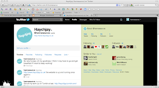
Making a Twitter back ground proved to be a bit more of a faff than it was really worth due to cut offs and things getting hidden, as seen below.
I finally managed to get the layout right with this one so that it showed up nicely at the side of the boxes on the Twitter webpage. I used my own Twitter to upload each background to and test to see it if worked or not.
These are the two boards that I created for the submission of this project, now I just need to wait and see what comes of it.
Monday, 17 January 2011
Subscribe to:
Post Comments (Atom)


No comments:
Post a Comment