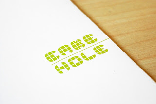
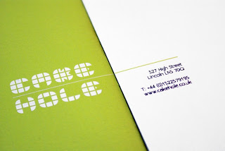
The stationery so far. I have changed it and gone with a square format to match the nature of the boxes that I have designed as part of the packaging. While I really like the square envelope and business card, the letterhead and compliments slip don't look right in this format.
I know that we are always being told to think outside of A-format, but it is the most economic paper size and haveing square format would create a lot of paper wastage.
Out of the two, I prefer the green envelope, it's so eyecatching and will stand out amongst the rest of the post.
I've triplexed the business card with a sheet of green card in the middle to keep the tie to the rest of the packaging, it also makes it quite interesting to look at. It's subtle, but it's there.
Subscribe to:
Post Comments (Atom)


No comments:
Post a Comment