Saturday, 7 May 2011

Tags

Toying with the idea of making tags instead of printing onto the boxes, seeing as the packaging really doesn't sit quite right with me yet.

However, I don't particularly like these. They just don't sit right with me at all. I think this whole brief needs to go through an overhaul.


Logo on.

And now all the product shots with the logo photoshopped onto everything. While I like the result here, I really don't think that this packaging is working for the context. It just doesn't feel like cake packaging to me and I know that I'm not happy with where this brief is right now.

I like my packaging and my construction methods, yes, but maybe this would be better in a different context. I don't know what that context is yet, but I do know that this packaging needs rethinking.


Boxes and bags

Boxes constructed! It's too difficult and too much of a faff to physically print the logo onto everything and have it as bright as I want, so for now I am simply going to photoshop the logo on.


Wednesday, 4 May 2011

Unable.

Due to time management and other projects taking over and being bigger than I initially intended, The Body Shop brief will not be going forward. Maybe if I have time at the end, but I doubt it.

Monday, 25 April 2011

Cakehole Stationery

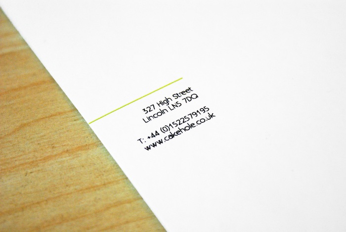
The stationery so far. I have changed it and gone with a square format to match the nature of the boxes that I have designed as part of the packaging. While I really like the square envelope and business card, the letterhead and compliments slip don't look right in this format.

I know that we are always being told to think outside of A-format, but it is the most economic paper size and haveing square format would create a lot of paper wastage.


Out of the two, I prefer the green envelope, it's so eyecatching and will stand out amongst the rest of the post.


I've triplexed the business card with a sheet of green card in the middle to keep the tie to the rest of the packaging, it also makes it quite interesting to look at. It's subtle, but it's there.